As I mentioned in my previous post I’m currently taking some time out to undertake some training and personal development. My last post was focussed around the subject of process, its importance and also how things can go wrong when your process is lacking.
I’ve now decided on a new project and I hope undertaking it will help me in my goal of developing a better working process and ultimately a better end product. I wanted to keep the next project roughly similar to the last to help me focus more on the process refinement. With that in mind I’m planning to produce a set of advertising images for Sipsmith Lemon Drizzle Gin. I will give more background on this project in my next post but for now I want to focus on defining a process and the first stage of that process.
I wont bore you with every stage of the process (there are 17) but if you are interested I have created a Trello board which shows a rough outline of each stage, you can view the board HERE
For now lets focus on stage 1, Project planning….
STAGE 1: PROJECT PLAN (OVERVIEW)
1.1 RECAP PREVIOUS PROJECT
1.2 3D COPPER DOG - WHISKEY BOTTLE – CRITIQUE
1.3 WHAT DID I LEARN FROM PREVIOUS PROJECT
1.4 GOALS FOR NEXT PROJECT
DELIVERABLES
- Project plan flow chart (See Trello Board)
- Key Learning Points (see 1.3 below)
- Copper Dog Project Critique (see 1.2 below)
- Define Goals (see 1.4 below)
STAGE 1.1 - RECAP PREVIOUS PROJECT
When starting anything I think it’s important to recap how you’ve done it before, why you did it that way and look at the key points that could be developed.
My previous project was the Copper Dog 3D Advertising Imagery project, I chose this project as on face value it’s a fairly simple image, yet it presents some interesting technical challenges and due to the refined nature of the image is quite hard to get correct. My inspiration for the project was a photography tutorial by Karl Taylor. His tutorial is really interesting as it breaks down a real-world lighting setup in a really easy to understand way.

Image from Karl Taylor Photography
My key learning goals were:
- Replicate the real-world lighting as demonstrated by Karl Taylor
- Accurately model and texture a drinks bottle, glass and Copper Dog accessory
- Use mass FX to drape the chain that hangs around the Copper Dog
- Setup Scrim style lighting using Corona Renderer (I didn’t use this in the end but it was interesting to try)
- Replicate the scrim effect through the use of planer lights and gradient maps
- Use HDRI studio pro to automate the above (great tool, there were a few technical limitations that held me back but I think it will be a great tool to use in the future)
- Tried out Corona Substance Map (Crashed Corona Interactive Map so I removed)}
- Re-touch and post process the final image.


Corona Lights with Gradient Maps vs HDRI Light Studio generated lighting

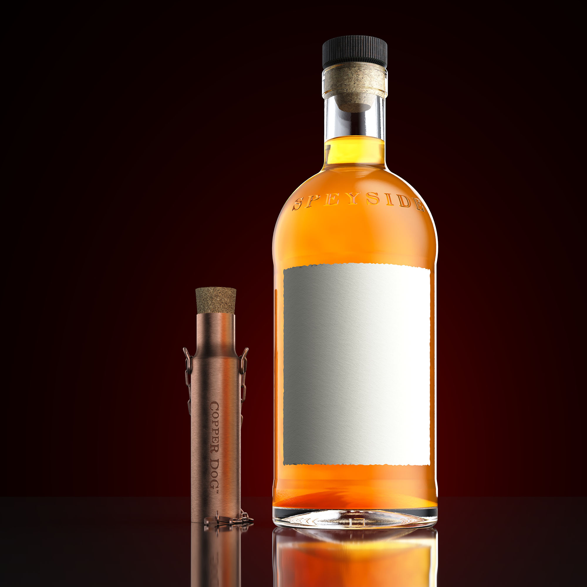
STAGE 1.2 - 3D COPPER DOG - WHISKEY BOTTLE – CRITIQUE
Summary
Overall I am happy with the end results of the project. I’ve taken some steps forwards which is the main goal but the image is still not where I want it to be. Of course I could keep refining this image but I think I will get more benefit from drawing a line under it and moving on. You can see my annotated image below, but I feel the key points are:
- Image perhaps looks too oversaturated, is the whiskey to luminous?
- Lighting on right hand side of bottle looks too strong creating an incorrect hierarchy across the image
- Should have tried another background colour or grey
- Bump on base of bottle too strong
- Too many highlights on the neck of the bottle (looks messy)
- Scale of ice cubes looks wrong,
- Could camera be a little higher?
- Lighting on glass could be refined
- Not happy with the texture on the Copper Dog, I think I should have sourced a higher resolution brushed texture.
- Should have rendered final image at a higher resolution (it’s currently 5000 pixels X 5000 Pixels) so close ups look crisper.

Annotated critiqe of Images
STAGE 1.3 – WHAT DID I LEARN FROM THE PREVIOUS PROJECT
I learnt a lot on this project and while the goal of these projects is always to learn new techniques. What became apparent on this project was the importance of process and thinking more about how I approach things, how I learn new tetchiness and how I can improve my process.
My overriding opinion of my last project was that I need to improve my process and stop wasting time through poor discipline.
Key technical learnings were:
- Understanding real world photography techniques and light setups
- The importance of softening CG lights, how similar lights would be softened in the real world and how we can ‘cheat’ to achieve the same effect in 3D
- Using HDRI light studio to speed up the placement and refinement of lighting and also understand the limitation of this approach
- Rim lights help separate objects from a dark background, flags either side of a reflective or refractive object help separate it from a light background
- Understanding that sometimes it can't all be done in the frame buffer, while we strive for photorealism sometimes this means removing details from an image in post to refine the look of the image and remove distractions
- Making sure the image focusses the viewer to the brand being shown.
STAGE 1.4 – GOALS FOR NEXT PROJECT
- Pre-plan the project and follow a defined process without jumping around
- Carry out proper pre-visualisation and pre-plan composition
- Light the scene with HDRI Light Studio
- Use Photogrammetry for some assets and refine process so it can be applied to other assets
- Use 3D Coat or ZBrush for some assets
- Use Displacement for embossed bottle texture
- Unwrap and texture some more complex objects
- Create a set of high quality images from 3-4 different angles with unique lighting setups
That's it for this stage, my next blog post will cover Stage 2: Reasearch